5 Most Effective Tips to Use Negative Space in Web Design
To create a fully functional website, many foundational website design principles must be considered. Among them, one such principle is negative space, more often known as white space.
When it comes to website designing or app design, negative space has a significant role to play. Experienced web designers believe that negative space allows a web page to “breathe,” which helps grab attention to the essential elements of the webpage.
It is important to remember that the goal of your design should be comprehension, and studies have indicated that adding negative space can enhance comprehension by 20%. For this reason, mastering this design process is crucial.
Additionally, a hierarchy of information can be created by skillfully using negative space, preventing all elements from simultaneously competing for the viewer’s attention. This post will discuss the value of white space in web design and offer tips on using it successfully.
What is Negative Space?
The empty space surrounding page items is known as negative space. Negative space is not effectively used when big, unnecessary blank spaces exist. However, an effective method to draw the viewer’s attention to the vital components of a page is to leave space surrounding them. The website will appear cluttered and difficult to read without any white space.
White space is an intentional design decision that can significantly affect a website’s appearance and user experience. It is more than just the lack of content.
Various Types of Negative Space in Web Design
It’s artful to take advantage of negative space. The harmonious equilibrium in design is achieved through the precise balancing act between large and little white spaces. This is how it functions.
Micro Negative Space
This kind of white space refers to the small, subtle areas of space within the design. It often enhances readability and accuracy by providing ample room for “breathing” between lines and letters.
Consider the gaps in words or the margin surrounding a button on a webpage. For example, the gap between each letter in the word “HELLO” acts as a micro negative space to keep the letters from looking crowded.
Macro Negative Space
The name itself suggests the meaning of this kind of space. Macro space is more noticeable between significant design elements. It works as a bridge and establishes a balance and focus by organizing different web page sections.
Macro negative space on a webpage can be found in the margins surrounding a text block or in the space between the header and the main content section. It offers visual relaxation and aids in directing the user’s attention to the main text.
Active Negative Space
Deliberate negative space, or active negative space, is empty space that is purposefully created and utilized to create shapes or express particular ideas.
A classic example of active negative space is the FedEx logo. If you examine the space closely between the letters “E” and “X,” you will see that the negative space forms an arrow.
Passive Negative Space
Passive negative space may not be intentional, but it nevertheless contributes significantly to improved readability and aesthetics by keeping things from getting crowded and letting them stand out.
For instance, photography refers to the backdrop surrounding the main subject. While it may not have been intentional, it highlights the subject by creating contrast and separation.
By skillfully employing white spaces to improve overall design aesthetics and functionality, designers may produce more aesthetically pleasing and user-friendly websites by better understanding these various forms of negative space in web design.
5 Ways for Efficient Use of Negative Space
It’s interesting how negative space can elevate an ordinary design to a truly outstanding level. You might develop the next big design concept using advice and inspiration sources. Keep reading on as we review five practical strategies for maximizing negative space.
Maintain Brand Integrity
Branding features, like trademarks and logos, stand out more when there is less clutter and competition. A logo with too little breathing room may appear crowded and overtaken by other design components. The mark may become less noticeable and less effective due to this breathing room restriction.
However, while it won’t cause congestion, too much space could make a logo look disconnected from the rest of the design. A logo that strikes this careful balance remains the main attraction, grabbing the audience’s attention and highlighting the brand’s existence.
Achieving the perfect balance is key in web design. That’s where web design Oakville company comes in. We know how to strike that sweet spot between clarity and harmony. Trust us to make your brand stand out while seamlessly fitting into your overall design.
Get Started with Gestalt Principle
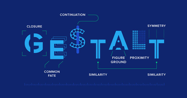
Source: Toptal
One of the most popular web design elements is the Gestalt notion of proximity. By employing this principle rule, you are sure that people identify closely connected elements as having comparable properties. To effectively utilize this idea, relevant elements should be grouped.
Take form design, for instance. Information such as name and address should go into one group and be slightly more spaced apart, while credit card information should go into another group. This will enable visitors to focus appropriately on critical areas.
Create an Impression of LAVISHNESS
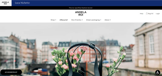
Source: Angela Roi
White space has aesthetic applications in addition to its primary usage as a tool for enhancing website user experience. If you’ve ever skimmed through a glossy magazine such as Vogue, you’ll notice that the liberal use of white space creates an air of sophistication, elegance, and luxury.
The above image shows how Angela Roi’s website is ethical and sustainable. The product is far more valuable and exclusive than the webpage’s real estate, as seen by the quantity of white space.
Clear Typography
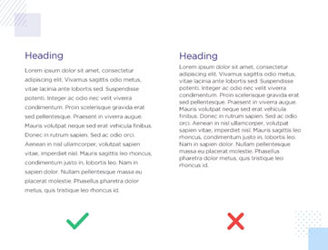
Source: Justinmind
As discussed, negative space is crucial to consider while designing typography. For every media, including print material, this rule applies. In addition to being large enough to read, letters must be appropriately spaced so that separate words, phrases, and paragraphs may be understood.
Consider how typography fits within a hierarchy of content. Headers must be understood immediately as the “leaders” of the material on the page. Large headlines should draw readers in because they typically provide an overview of the material.
For readers to understand the relationship, paragraphs beneath headings should be closer to the header. However, the paragraphs themselves require more breathing room, or the writing would appear rushed.
Pay Attention to the Negative Space Around CTAs
Websites with a primary call-to-action button are the most helpful.
- For instance, “Make Reservation” might be on a restaurant’s website.
- “Buy Now” could apply to eCommerce companies.
- A blog’s contact button (CTA) is a button that leads to the owner’s website. But it might be “Subscribe.”
On your website, white space should encircle CTAs. This does not, however, imply that you must keep your buttons and text distinct. CTAs should be easy for visitors to find and not distract from. It’s not only call-to-action buttons that use white space. Website forms benefit from it as well. Visitors may give up on signing up if they need help finding the checkout forms or contact information.
Leverage Negative Space to Improve User Experience
Negative space is a crucial design component that significantly impacts your website’s effectiveness. Effective use of white space can boost visual hierarchy, increase readability, and produce a more visually beautiful and user-friendly design. Therefore, don’t undervalue white space in your website design; it just might be the secret to a profitable and exciting online presence.
Are you looking for an experienced website design service? Get in touch with WebDesk Solution as we understand how to leverage the power of negative space to create both functional and eye-pleasing websites

- How Developers Are Shipping Software Faster With AI in 2026

- Building a Secure ID Scanner App for Age-Restricted Retail
- How Custom Plugins Can Improve WordPress Website Performance
- UX vs Marketing: What Really Drives User Engagement?
- Why Custom eCommerce Website Development Beats Templates Every Time