How To Choose Right Typography?
Let discuss about, How to choose right typography for web design.
What is Typography?
Different types of writing can be found all around us in our everyday lives. From bold bubble fonts styles to gaming fonts, or whether they are in the form of documents, projects, books material or any type of writing. Even we make messaging in the form of text writing. In short, writing is an essential part of our life.
It is common for us to sense, whenever we read some kind of text, that the designer behind the scenes is using writing to convey some expressions. Moreover, different types of modes, expressions are expressed simply through different types of writing.
In this article, we’ll discuss:
- What is Typography?
- History
- Elements of Typography
- Display fonts
So, let’s discuss first what is typography.
Typography
Typography is the art in which the style and art of writing documents, projects and other material either for anyone else or for yourself.
However, it includes structure, font and appearance. The combination of all these factors makes it easy to transform a text into a living document.
History
Typography with movable types was invented in the 11th century in China by Bi Sheng. His movable type system included ceramic materials and other clay type printing.
However, the first typography was invented by Johannes Gutenberg in 1440. However, this type of typography was craft included just like magazines, press newspapers etc.
Typography was invented due to different methods to produce text. Early typography was mostly used in religious and royal aspects.
In the 1920s and 1930s, the new typography was introduced in Central Europe. It brought graphics designing and information design to the forefront.
Moreover, the new typography was introduced by Jan Tschichold, who was a German calligrapher and book designer. He is also known as the father of typography.
Importance of typography
Typography is not just to choose a font. It creates a user interface. To makes your content well toned, accessed easily, readable and decorative using different points.
Font style makes such content digestible for the audience as well as provides eye-catching content that grabs the attention of readers. Also, add brand recognition in a unique style.
Elements of Typography
To get started first you have to consider eight essential elements of typography. Let’s talk about them.
Fonts and typefaces
Normally, we treat fonts and typefaces similarly. We consider them as synonyms of each other but it is wrong. Font is the representation of text that we write and decorate according to our desire. For example, if we use Times New Roman, regular and 10-points in your document, it is a font. On the other hand, typefaces consist of different font-weights and styles. Also we can say, it is a family of fonts.
There are four types of typefaces. Let’s take a look at them visually.
Leading, kerning and tracking
These are the types of typography that are used for line spacing. Leading is used for spacing between lines of text we write. Kerning is used for spacing between two characters and Tracking refers to the spacing between entire paragraphs. True line spacing makes it easier for the audience to read and understand your content more easily.
Contrast
Contrast helps you to generate the perfect message that you want to convey to the audience. Most of the designers use different fonts, colors, styles to make their message attractive and interesting.
You can make your text attention grabbing by spending some time on contrast.
Color
Text color is a vital part in typography. It can make your text attractive, eye-catchy and stand out. It can make the tone of your message interactive.
However, it cannot be taken easily. One may have to consider it carefully. Choosing the wrong color can make your text unreadable and can result in a grubby interface.
However, color has three components that a designer has to consider how to balance these. These components include value, shade and saturation.
Alignment
Alignment is a process in which one composes images and text to ensure equality. Many designers use margins in their project or document to ensure that their logo and body of text are associated with each other.
However, during alignment it is proved to be a perfect practice to consider industry standards.
Hierarchy
Hierarchy is an essential element in typography. It ensures that which type of text is read first and which has to be read last. It makes a difference between text that is more important and text that is less important. We can use different elements to ensure the hierarchy of text like color, size, position or align, contrast and surroundings.
Consistency
It is important to keep your text consistent. It means that one must use a similar font size so that it is easy for readers to understand and read your text.
You can use up-to three font sizes in your document: one for heading, another for subheading and last for your paragraph text. Using different fonts and colors can result in unreasonable text.
White Spaces
White spaces are referred to as “negative spaces”. It is the space around the text and images. Mostly, it is not noticed by the audience. But it is important to consider these spaces to make your text readable and perfect.
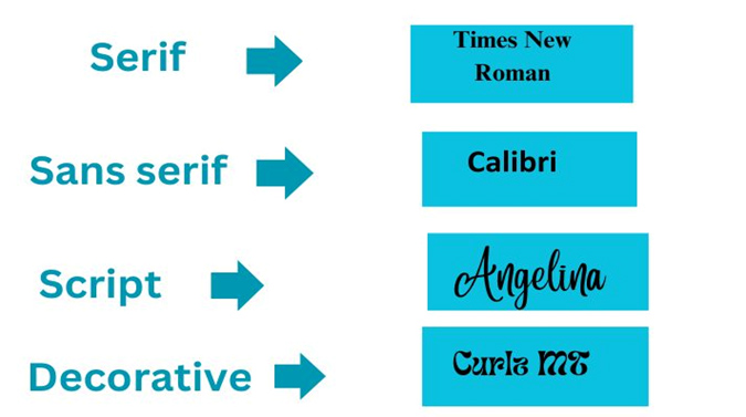
Display fonts in typography
In typography, fonts are displayed in five types. These are:
- Serif
- Sans serif
- Script
- Decorative
- Monospaced
Serif: A serif font has a decorated stroke that extends at the end of letterspace. E.g: Times New Roman, Georgia, Garamond.
Sans serif: Sans serif doesn’t have a decorative stroke like serif. They are usually used in absence of decorative strokes and considered modern and friendly. E.g: Arial, Calibri.
Script: Script is a classification that directs with the handwriting and calligraphy. Most of the scripts are formal and composed of decorative flourishes. E.g: Dancing Script, Lobster, Parisienne.
Decorative: These fonts come with a great personality. These are the highly decorated version of serif, sans serif and other fonts. These are used to make a unique look. E.g: Alathena.
Monospaced: Monospace fonts are used for creating typewriter text lines and codes. E.g: Courier, Lucida Console, Menlo, Monaco.
How to choose the right typeface?
As we’ve discussed about typography and its elements. Now, the question arises how to choose the right typeface for your website? Choosing a font for your website proved to be burdensome for you. Here we’ll discuss what steps you have to take to choose a typeface that meets your requirements.
- Start from a point that completely describes or reflects your message or brand. So that the audience feels welcoming and high-end.
- Choose the font with respect to the tone of the message. For example, if you are conveying some serious information, choose a less decorative and formal font.
- After deciding what typeface to use, choose carefully the font. The font must be able to be read and accessed.
- Many designers overlook the point that you have to choose a font that is user-friendly. Commonly used fonts like Google fonts provide web-based fonts that perfectly approach the browser.
- If you are not still aware of what to do, take some time. Consider other people’s work and learn from them.
- The best practice to choose the perfect font is to test again and again.
Conclusion
Typography, no doubt, is an essential part of your writing. Consider each element carefully. If you are still confused about what to do, consider the typeface that is your favorite. Don’t hesitate to ask a question from the designer of that specific typeface.
A bit of hard work can make your text outstanding and unique from others.

- How Developers Are Shipping Software Faster With AI in 2026

- Building a Secure ID Scanner App for Age-Restricted Retail
- How Custom Plugins Can Improve WordPress Website Performance
- UX vs Marketing: What Really Drives User Engagement?
- Why Custom eCommerce Website Development Beats Templates Every Time