Dos and Don’ts of Catalogue Design: Best Practices to Follow
In the world of business, where first impressions can make or break a deal, your catalogue is your silent ambassador. It’s the gateway through which potential customers step into your world of products and services. But let’s face it – a catalogue isn’t just a collection of pretty pictures and descriptions. It’s a powerful marketing tool that, when designed right, can be a game-changer for your brand.
Welcome to our blog on “The Dos and Don’ts of Catalogue Design” brought to you by our expert catalogue design company. We’ll explore strategies to transform your catalogue into a sales-boosting, brand-amplifying tool. Whether you’re a marketer or business owner, let’s dive into the art and science of catalogue design.
The Dos of Catalogue Design
Clarity and Organization
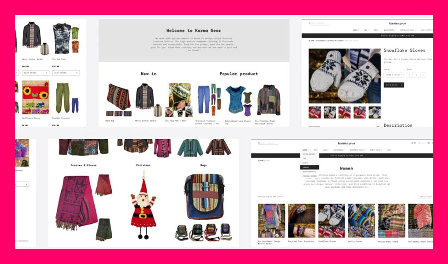
When it comes to catalogue design, clarity and organization are paramount. Your catalogue should be easy to navigate, and the information should flow seamlessly. Use a clear hierarchy to arrange products or services, ensuring that the most important items are prominently featured. Group related items together logically so that customers can find what they’re looking for without frustration. A well-organized catalogue not only enhances the user experience but also reflects positively on your brand’s professionalism. If you’re seeking expert assistance in creating a well-structured catalogue, consider partnering with a top-tier catalogue design company.
Consistency and Branding
Consistency is key in catalogue design. Maintain a consistent color scheme and typography throughout your catalogue to create a cohesive look. Incorporate your brand elements such as your logo and slogan to reinforce brand recognition. Consistency in product presentation styles, like using the same image layouts and product placement, helps maintain a uniform and professional appearance.
High-Quality Imagery
Images are the heart of any catalogue. Use professional, high-resolution images that showcase your products or services in the best possible light. Ensure that images accurately represent the color and details of your offerings. If necessary, provide multiple images that show products from various angles. High-quality imagery not only attracts potential customers but also instills confidence in the quality of your products.
Compelling Descriptions
Product descriptions play a crucial role in persuading customers to make a purchase. Write concise yet informative descriptions that highlight key features and benefits. Use persuasive language to entice readers and make them envision how the product or service can solve their problems or fulfill their needs. Well-crafted descriptions can significantly impact your catalogue’s effectiveness as a sales tool.
White Space and Layout
Embracing white space in your catalogue design is a fundamental principle. White space, or negative space, refers to the areas without content, such as margins and gaps between text and images. It provides visual breathing room and prevents your catalogue from appearing cluttered. Balancing text and images is essential to ensure that the layout is visually appealing. Additionally, optimize your layouts for both print and digital formats to reach a broader audience.
Clear Call to Action (CTA) Placement
Include well-defined calls to action (CTAs) throughout your catalogue. Make it easy for readers to take the desired action, whether it’s making a purchase, contacting your business, or visiting your website. Strategically place CTAs near product descriptions or images to guide readers on the next steps. A clear CTA ensures that your catalogue not only informs but also prompts action.
Consider User Experience (UX) in Digital Catalogues
If you’re creating a digital catalogue, prioritize the user experience (UX). Ensure that your digital catalogue is responsive, meaning it adapts smoothly to different devices and screen sizes. Implement user-friendly navigation features, such as clickable links and interactive elements. A positive digital UX encourages prolonged engagement and boosts the chances of conversions.
The Don’ts of Catalogue Design
Clutter and Overcrowding
One of the most significant mistakes in catalogue design is clutter and overcrowding. Avoid cramming too much information onto a page. An overcrowded catalogue overwhelms readers and makes it challenging for them to focus on individual products. Instead, prioritize clean and well-structured layouts that guide the reader’s eye naturally from one item to the next.
Inconsistent Design Elements
Inconsistency in design elements can detract from the professionalism of your catalogue. Steer clear of mixing fonts and using inconsistent colors. Consistency in design helps establish a visual identity for your brand. Ensure uniformity in image sizes, styles, and product presentation. A cohesive look and feel make your catalogue more visually appealing and easier to navigate.
Poor Image Quality
Low-quality or pixelated images can be a major turn-off for potential customers. Blurry or distorted visuals can make your products appear less desirable and unprofessional. Always use high-quality images that accurately represent your offerings. If you must resize or crop images, do so carefully to avoid degradation in quality.
Lengthy, Unengaging Descriptions
While informative product descriptions are essential, lengthy and unengaging text can overwhelm readers. Avoid writing verbose, technical jargon-filled descriptions that may confuse or bore your audience. Instead, aim for concise yet compelling descriptions that capture the essence of your products or services. Use language that resonates with your target audience and sparks their interest.
Neglecting Mobile and Web Compatibility
In today’s digital age, neglecting the compatibility of your catalogue with online platforms can be a costly mistake. Don’t limit your catalogue design to print alone. Ensure that your catalogue is optimized for digital formats and responsive to various devices. Many customers browse and shop online, and a catalogue that works seamlessly on the web and mobile devices can significantly expand your reach.
Overuse of Technical Jargon
Using excessive technical language in product descriptions can alienate potential customers who may not be familiar with industry-specific terms. Avoid the overuse of jargon and opt for clear, plain language that everyone can understand. This approach ensures that your catalogue is accessible and engaging to a wider audience.
Neglecting Call-to-Action (CTA) Elements
A catalogue isn’t just about showcasing products; it should also encourage action. Neglecting clear and strategically placed CTAs can hinder the effectiveness of your catalogue. Include compelling CTAs that prompt readers to take the next step, whether it’s making a purchase, requesting more information, or signing up for newsletters. Well-placed CTAs guide readers through the buying journey, increasing conversion rates.
Conclusion
In conclusion, following these dos and don’ts of catalogue design is crucial for creating an effective marketing tool. Prioritize clarity, consistency, high-quality imagery, engaging descriptions, and digital compatibility. Partnering with a professional catalogue design company can further enhance your results. By implementing these best practices, you’ll create a compelling catalogue that engages customers, drives sales, and strengthens your brand’s identity.

- How Developers Are Shipping Software Faster With AI in 2026

- Building a Secure ID Scanner App for Age-Restricted Retail
- How Custom Plugins Can Improve WordPress Website Performance
- UX vs Marketing: What Really Drives User Engagement?
- Why Custom eCommerce Website Development Beats Templates Every Time