How to Use Color Psychology and Symbolism in Your Book Cover Design
When we talk about books, we often hear people say, “Don’t judge a book by its cover.” But let’s be real, book covers are like friendly waves from stories. They really affect readers, pulling them in and making them want to see what’s inside. In this article, we’re going to explore the interesting world of making book covers that work, and understand why book cover design services work the way they do.
We’ll find out why having less stuff on a cover can actually make it better. We’ll see how keeping things simple can say a lot and get people interested. And of course, we’ll talk about the cool stuff you can do with colors on book covers, like how they can make you feel different things and leave a strong memory.
We’ll share a bunch of knowledge, coming from our experience of working with authors and big publishing companies for more than 25 years, as well as with book cover design services. By mixing what we’ve learned from real life with proven ideas about colors, book cover fonts, and layout, we’ll show you the secrets of making book covers that catch people’s eyes and stick in their minds.
The Importance of Book Cover Design Services
Capturing Attention
In a crowded market, a standout cover can be the difference between success and failure, making skilled book cover designers highly valued. Your cover needs to hint at the story inside without giving everything away, enticing readers to pick it up and explore further. It’s crucial that your book cover communicates the value of what’s inside, making it worth a potential buyer’s time and attention.
Binding Matters
When your book sits on a shelf, all readers see is the spine, so it’s important that the cover design extends to the spine as well. A strong binding ensures the book stays intact, so it’s essential to prioritize quality in this aspect.
Showcasing Reviews
A book review offers valuable insight into a reader’s experience. A good review should engage with the complexities of the book and provide thoughtful analysis, focusing on aspects like freshness, skill, and insight.
Offering a Peek Inside
The goal is to attract readers to your book, but it’s important not to reveal too much on the cover. Attention-grabbing and flashy are not the same thing. The purpose of a book cover is to convey the essence of your story in a unique way. It’s important not to overload the cover with too much information, as this can overwhelm potential readers. Instead, focus on creating a cover that intrigues and entices.
Conveying Information
Clarity is key in book design. Whether your book is fiction, children’s literature, or a health guide, the cover should offer a glimpse into the core message. The cover should give readers an idea of what to expect inside, guiding them towards your story or message.
Let Your Cover Speak
Treat your book cover as a living thing that represents your story. The best covers have a single compelling element that draws in buyers, sparking their curiosity and prompting them to explore further.
How to Use Symbolism?
Utilizing symbolism in your book marketing can be a powerful copywriting strategy. Symbolism, a literary device that employs tangible objects or imagery to convey abstract concepts, can add depth and resonance to your marketing materials.
Why incorporate symbolism?
Using symbols makes your marketing stronger. When you use symbols that everyone knows, like a white dove for peace, you can make people feel lots of things with just a little image. This grabs people’s attention and helps them understand what you’re trying to say better.
Also, symbols make your book more interesting. When you hint at deeper ideas or parts of the story with symbols, it makes readers curious and excited. Everyone loves solving a good mystery! If you’re seeking to incorporate powerful symbolism into your book cover design, professional book cover design services can help bring your vision to life with expert craftsmanship and creativity.
Use symbolism in your book marketing materials in the following four ways:
Set the Scene with Cultural Symbols:
Using famous cultural symbols can quickly make your story feel just right. For example, if your story happens in Paris, talking about famous places like the Eiffel Tower or the Seine River can make readers feel like they’re really there, soaking in the romantic vibes of the city. By using these symbols, you can make readers feel fancy, romantic, and ready for adventure, all things that people usually think about when they think of Paris. This trick not only makes your story feel more real but also helps readers picture the setting in their minds more clearly.
Attracting Attention
In a busy market, a unique cover can make all the difference, highlighting the importance of skilled book cover designers. Your cover should tease the story inside without giving it all away, encouraging readers to take a closer look. It’s vital that your cover reflects the value of what’s inside, making it appealing to potential buyers.
The Importance of Binding
When your book is on a shelf, only the spine is visible, so it’s crucial for the cover design to extend to the spine too. A sturdy binding keeps the book intact, emphasizing the need for quality in this aspect.
Highlighting Reviews
Book reviews provide valuable insights into readers’ experiences. A good review should delve into the intricacies of the book and offer thoughtful analysis, focusing on elements like originality, skill, and depth.
Providing a Sneak Peek
While it’s essential to attract readers with your cover, it’s equally important not to reveal too much. Being attention-grabbing is different from being flashy. The purpose of a book cover is to capture the essence of your story in a unique way. Overloading the cover with information can overwhelm potential readers. Instead, aim to create a cover that intrigues and captivates.
Communicating Information
Clarity is key in book design. Whether your book is fiction, children’s literature, or a health guide, the cover should offer a glimpse into the main message. It should give readers an idea of what to expect, guiding them towards your story or message.
Let Your Cover Do the Talking
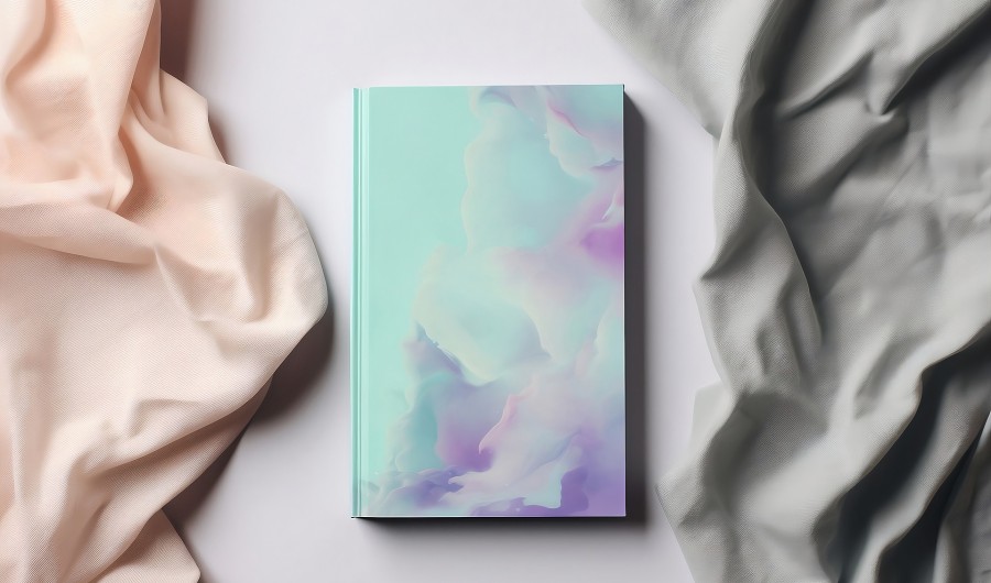
Treat your book cover as a representation of your story. The best covers have a single captivating element that draws in buyers, piquing their interest and encouraging them to explore further. Colors are also essential in book cover design as they shape emotions and set tones. Incorporating the right color scheme can attract readers.
Highlight Your Book’s Themes:
Symbols are like secret codes that help tell the main ideas of your book. Like in “To Kill a Mockingbird,” where the mockingbird means innocence and doing what’s right. In your own writing, you can make up symbols that show the most important ideas of your story. It could be something that keeps showing up, something important in the story, or something that means more than just what it is. Using symbols like these can make your story more meaningful and get readers really interested.
Use Visuals in Ads:
Using symbols in pictures can really help promote your book. Think about making cool pictures that show important symbols or ideas from your story. For example, if your book has a special symbol like a magical key or a mysterious necklace, you can use pictures of these things in your ads. These visual ads can grab people’s attention and make them want to know more about your book. Instead of spending a lot on big billboards, you can use social media ads, website pictures, and emails to show off your book to the right people for less money.
Create Vivid Imagery:
The “show, don’t tell” rule is a big part of storytelling. Instead of just saying things outright, you can make your story more interesting by using descriptions and symbols. This helps readers feel like they’re right there in the story. For example, instead of just saying a character is sad about leaving home for college, you can describe everything around them: the empty room, the memories, and the feeling of both loss and excitement. Using symbols like this makes your story more powerful and makes readers really feel what’s happening.
Using symbolism in your book marketing approach can help you appeal to readers’ psychology by strengthening their emotional connection to your work and holding their attention. You can elicit strong emotional responses from readers on a subliminal level by employing symbols to communicate the ideas of your story and generate images. Symbolism provides layers of meaning to your marketing products through colorful descriptions that pique their interest, attention-grabbing visual imagery that grabs their attention, or cultural allusions that arouse comfortable feelings. This stronger psychological connection to your work makes it more memorable and captivating, which raises the possibility that readers may identify with and get invested in your narrative.
Conclusion
There’s quite a bit to think about when it comes to crafting the perfect book cover! Indeed, a small alteration in your book’s cover design can yield significant results. It’s a fact: people tend to form initial impressions of a book based solely on its cover.
Ensuring your cover design effectively communicates with your audience and aligns with the genre’s norms is paramount. Selecting fonts that are visually appealing and utilizing colors that harmonize well while also standing out are key considerations in this process. After all, your cover serves as the initial gateway to your story, beckoning readers to explore further. Colors play a big role in all the book cover design services you’ve used, and they’ll be consistent across all your graphic elements.
Bookstores put books on display with their covers facing out, so your cover is the first thing a potential buyer sees. Creativity in cover design is what makes a customer reach for your book, especially in a place like a supermarket where all the books are right there in front. Even the author’s name, the font, and the overall creativity of the cover design can make a big difference.
FAQs
What are the best book cover design colors?
While science fiction uses futuristic hues to portray extraterrestrial themes, fantasy genres embrace a spectrum of vivid colors to take readers to wonderful regions. The combination of red and black in horror films evokes tension and terror.
Why are most book covers blue?
The adaptable color blue is frequently linked to serenity, dependability, and trust. It is frequently used on book covers for mystery, spirituality, and self-help genres because it conveys a sense of peace.
What Color is best to read on?
Understanding served as the control variable. The findings indicate that both with and without dyslexia are significantly affected by the use of particular background colors. Reading performance was considerably better with warm background colors—Peach, Orange, and Yellow—than with cool background colors—Blue, Blue Grey, and Green.
What is the color mode for a book cover?
For the greatest results when creating a cover art for a printed book, use CMYK; for a digital copy, use RGB. Remember that for optimal quality, a cover intended for printing should have a resolution three or four times larger than that of an eBook.

- How Developers Are Shipping Software Faster With AI in 2026

- Building a Secure ID Scanner App for Age-Restricted Retail
- How Custom Plugins Can Improve WordPress Website Performance
- UX vs Marketing: What Really Drives User Engagement?
- Why Custom eCommerce Website Development Beats Templates Every Time